
I started to create my final poster by changing the colour balance of the image. I made the colours cooler which I felt appealed more to the horror genre by making it look scarier and also linking well to the plot of my film because they are in a cold environment.

This is what the image turned out to look like.

I then got an image of TV interference and pasted this over the image. I took down the transparency to make it look like this was camera distortion, appealing to the found footage genre.

I then needed to add institutional logos and a rating. I got the Lionsgate Logo, Bad Robot logo and a 15 film rating box in black against a black background and exported these in to custom paintbrushes. This then meant I could use them as a paintbrush tool so I could place them where I liked in whatever colour I wanted with no background.
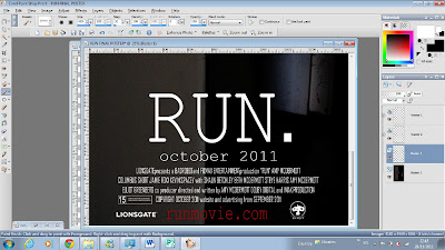 This is what they looked like once I had placed them in appropriate places. I feel that this really added to the realistic look of the poster.

No comments:
Post a Comment