Research
http://amcdermott-a2portfolio.blogspot.com/2011/04/what-is-difference-between-trailer-and.html
http://amcdermott-a2portfolio.blogspot.com/2011/05/analysing-teaser-trailers-spider-man-3.html
http://amcdermott-a2portfolio.blogspot.com/2011/05/analysing-film-posters-spiderman-3.html
http://amcdermott-a2portfolio.blogspot.com/2011/05/analysing-teaser-trailers-toy-story-3.html
http://amcdermott-a2portfolio.blogspot.com/2011/05/analysing-film-posters-toy-story-3.html
http://amcdermott-a2portfolio.blogspot.com/2011/06/analysing-teaser-trailers-cloverfield.html
http://amcdermott-a2portfolio.blogspot.com/2011/05/analysing-film-posters-cloverfield.html
http://amcdermott-a2portfolio.blogspot.com/2011/09/analysing-teaser-trailers-social.html
http://amcdermott-a2portfolio.blogspot.com/2011/05/analysing-film-posters-social-network.html
http://amcdermott-a2portfolio.blogspot.com/2011/05/analysing-teaser-trailers-lord-of-rings.html
http://amcdermott-a2portfolio.blogspot.com/2011/05/analysing-film-posters-lord-of-rings.html
http://amcdermott-a2portfolio.blogspot.com/2011/05/analysing-film-magazine-front-covers.html
http://amcdermott-a2portfolio.blogspot.com/2011/05/analysing-film-magazine-front-covers_29.html
http://amcdermott-a2portfolio.blogspot.com/2011/05/analysing-film-magazine-front-covers_30.html
http://amcdermott-a2portfolio.blogspot.com/2011/05/analysing-film-magazines-sight-and.html
http://amcdermott-a2portfolio.blogspot.com/2011/05/analysing-film-magazines-film-review.html
http://amcdermott-a2portfolio.blogspot.com/2011/05/reflection-on-research.html
Audience Research
http://amcdermott-a2portfolio.blogspot.com/2011/06/my-target-audience.html
http://amcdermott-a2portfolio.blogspot.com/2011/06/target-market-questionaire.html
http://amcdermott-a2portfolio.blogspot.com/2011/06/target-market-questionnaire-results.html
http://amcdermott-a2portfolio.blogspot.com/2011/06/find-your-tribe.html
http://amcdermott-a2portfolio.blogspot.com/2011/06/reflection-on-target-market-research.html
Further Research
http://amcdermott-a2portfolio.blogspot.com/2011/06/mindmaps-for-chosen-genre-horror.html
http://amcdermott-a2portfolio.blogspot.com/2011/06/fruther-research-horror-genre.html
http://amcdermott-a2portfolio.blogspot.com/2011/06/further-research-handheld-camera.html
http://amcdermott-a2portfolio.blogspot.com/2011/06/further-research-found-footage-genre.html
http://amcdermott-a2portfolio.blogspot.com/2011/06/further-research-blair-witch-project.html
http://amcdermott-a2portfolio.blogspot.com/2011/06/further-research-quarantinerec.html
http://amcdermott-a2portfolio.blogspot.com/2011/06/further-research-paranormal-activity.html
http://amcdermott-a2portfolio.blogspot.com/2011/06/further-research-tunnel.html
http://amcdermott-a2portfolio.blogspot.com/2011/12/research-in-to-sountracks.html
http://amcdermott-a2portfolio.blogspot.com/2011/06/research-in-to-soundtracks-happening.html
http://amcdermott-a2portfolio.blogspot.com/2011/06/research-in-to-soundtracks-candyman.html
http://amcdermott-a2portfolio.blogspot.com/2011/06/research-in-to-soundtracks-insidious.html
http://amcdermott-a2portfolio.blogspot.com/2011/10/research-in-to-soundtracks-rosemarys.html
http://amcdermott-a2portfolio.blogspot.com/2011/06/reflection-on-further-research.html
http://amcdermott-a2portfolio.blogspot.com/2011/06/institutional-context-research-into.html
http://amcdermott-a2portfolio.blogspot.com/2011/06/inspirational-practitioners.html
http://amcdermott-a2portfolio.blogspot.com/2011/06/youtube.html
http://amcdermott-a2portfolio.blogspot.com/2011/06/film-classifications.html
Planning
http://amcdermott-a2portfolio.blogspot.com/2011/06/character-development.html
http://amcdermott-a2portfolio.blogspot.com/2011/06/film-treatment.html
http://amcdermott-a2portfolio.blogspot.com/2011/06/script-for-teaser-trailer.html
http://amcdermott-a2portfolio.blogspot.com/2011/06/storyboard-for-teaser-trailer.html
http://amcdermott-a2portfolio.blogspot.com/2011/06/shot-list.html
http://amcdermott-a2portfolio.blogspot.com/2011/09/plan-for-film-poster.html
http://amcdermott-a2portfolio.blogspot.com/2011/09/plan-for-film-magazine-front-cover.html
http://amcdermott-a2portfolio.blogspot.com/2011/09/organisation-of-location.html
http://amcdermott-a2portfolio.blogspot.com/2011/09/organisation-of-actors.html
http://amcdermott-a2portfolio.blogspot.com/2011/09/organisation-of-costumes.html
http://amcdermott-a2portfolio.blogspot.com/2011/09/organisation-of-props.html
http://amcdermott-a2portfolio.blogspot.com/2011/09/organisation-of-equipmentsoftware.html
http://amcdermott-a2portfolio.blogspot.com/2011/08/organisation-of-sounds.html
http://amcdermott-a2portfolio.blogspot.com/2011/06/how-i-have-met-audience-expectations-of.html
http://amcdermott-a2portfolio.blogspot.com/2011/09/reflection-on-planning-process.html
http://amcdermott-a2portfolio.blogspot.com/2011/08/gant-chart.html
Creation of Drafts
http://amcdermott-a2portfolio.blogspot.com/2011/10/contact-sheet-photographs-for-film.html
http://amcdermott-a2portfolio.blogspot.com/2011/09/contact-sheet-photographs-for-magazine.html
http://amcdermott-a2portfolio.blogspot.com/2011/09/making-my-teaser-trailer-draft.html
http://amcdermott-a2portfolio.blogspot.com/2011/09/making-my-film-poster-draft.html
http://amcdermott-a2portfolio.blogspot.com/2011/09/making-my-magazine-cover-draft.html
First Drafts
http://amcdermott-a2portfolio.blogspot.com/2011/09/teaser-trailer-first-draft.html
http://amcdermott-a2portfolio.blogspot.com/2011/09/film-poster-first-draft.html
http://amcdermott-a2portfolio.blogspot.com/2011/09/film-magazine-cover-first-draft.html
Audience Feedback - Drafts
http://amcdermott-a2portfolio.blogspot.com/2011/11/audience-feedback-drafts.html
http://amcdermott-a2portfolio.blogspot.com/2011/10/plans-for-final-versions.html
Planning - Final Versions
http://amcdermott-a2portfolio.blogspot.com/2011/11/new-script-for-teaser-trailer-final.html
http://amcdermott-a2portfolio.blogspot.com/2011/10/production-schedule.html
http://amcdermott-a2portfolio.blogspot.com/2011/11/organisation-of-new-sounds.html
http://amcdermott-a2portfolio.blogspot.com/2011/11/organisation-of-equipment-for-final.html
http://amcdermott-a2portfolio.blogspot.com/2011/11/organisation-of-new-costumes-for-final.html
Creation of Final Versions
http://amcdermott-a2portfolio.blogspot.com/2011/11/final-filming-behind-scenes.html
http://amcdermott-a2portfolio.blogspot.com/2011/10/making-my-final-teaser-trailer.html
http://amcdermott-a2portfolio.blogspot.com/2011/10/making-my-final-magazine-cover.html
http://amcdermott-a2portfolio.blogspot.com/2011/12/making-my-final-magazine-cover.html
Final Versions
http://amcdermott-a2portfolio.blogspot.com/2011/11/final-teaser-trailer.html
http://amcdermott-a2portfolio.blogspot.com/2011/11/final-film-poster.html
http://amcdermott-a2portfolio.blogspot.com/2011/11/final-magazine-cover.html
Audience Feedback - Final Versions
http://amcdermott-a2portfolio.blogspot.com/2011/11/audience-feedback-final-versions.html
Updated Gant Chart - Progress so far and how I kept to schedule
http://amcdermott-a2portfolio.blogspot.com/2011/11/updated-gant-chart.html
Evaluation
http://amcdermott-a2portfolio.blogspot.com/2011/12/evaluation-1-in-what-ways-does-your.html
http://amcdermott-a2portfolio.blogspot.com/2011/12/evaluation-2-how-effective-is.html
http://amcdermott-a2portfolio.blogspot.com/2011/12/evaluation-3-what-have-you-learned-from.html
http://amcdermott-a2portfolio.blogspot.com/2011/12/evaluation-4-how-did-you-use-media.html
Sunday, 4 December 2011
Evaluation - 4) How did you use media technologies in the construction and research, planning and evaluation stages?
I felt I made really good use of technology throughout all my work. Here is all the things I used, how I used them and how useful I found them:

I used Blogger the most throughout my project. I uploaded all my work to it which was really easy and useful. It meant I could add videos and images to support my written work with a clear heading above each post. I really liked how I could combine this use of technology with my written work to support it and make it look more creative and interesting to read. I feel by using Blogger I have thought more about how I display my work as well as thinking about uploading content to the internet, such as videos. Blogger has made me more creative as I have really thought about how to display work within a blog post rather than for example, just on a word document with supporting images. However, I did have some problems with Blogger, such as it was difficult to place image where I wanted and quite often the text was positioned differently on the actual post than on the editing page. This was awkward because I have to move text about in order for it to align in the way I want it to. Sometimes when I wanted an image to be extra large, it would go out of the blog area and on the the navigation which didn't look very good at all, so sometimes I was limited to a smaller size. It also took a very long time for videos too upload, which wasn't really too much of a problem as I could still edit my post, but it would sometimes crash Blogger meaning I would lose my work when it didn't save. Overall, I think Blogger was a really useful tool and I feel it was a good way to upload and display all my work in one place. I also used Blogger to see other people's blogs for research, such as in my character development research. This was really useful as it was a good way to gain information.


Google was also another really useful website. It was a good tool for my research because it allowed me to search for websites that helped gain useful information and also find images I needed, such as film posters. I used Google a lot because it was easy and quick to use in order to find all the information I needed for my research.
Wikipedia was also a very useful tool. It has a lot of information on it which was really good for my research. I found most of my information on hear, such as research in to American film classifications, film distribution company, inspirational practitioners, YouTube, genres and films. I used this by copy and pasting extracts in to my blog and highlighting important parts which I could look back over easily and also learn from this information which was useful for my further development. However, there is chance that the information of Wikipedia isn't true as anyone can change it, so I did have to check to make sure I was gaining valid information. It is also sometimes a lot of information to read, so I had to read through and pick out the parts I felt were important.

I also found IMDB very useful. It had a lot of information on films which was very useful for my research in to genre specific films, such as the plot summary, screen shots, directors and so on. I felt that all the information on this website was valid so it was a very useful and trust worthy source. It also had some useful articles such as the best found footage style films which was really useful when choosing some to research in to.

YouTube was extremely helpful towards my research. From this I could look in to teaser trailers to analyse easily and quickly which was a very useful tool. I then used a video converter which I will talk about later to convert these in to AVI files to upload to my blog. YouTube was also very useful when I was researching in to movie soundtracks. I got videos that people had uploaded of the soundtracks and then converted them to the videos you will see on my blog which I will explain later.

Outlook was really useful for keeping in contact with my actors. It allowed me to organise dates and email them scripts which was very useful. I also used it at college to email work to my Hotmail account which I could then continue at home. Outlook web mail was also useful as it meant I could use this email at home as I don't have outlook set up on my laptop.

I also used Hotmail to email work to myself, as I mentioned before. This was really useful and easy way to transfer and also back-up any work as I could access it from any computer anywhere as Hotmail is on-line. I also used Hotmail to keep in contact with my actors in the same way I used Outlook.

MSN also allowed me to easily keep in contact with my actors as well as send them files and even my final teaser trailer, poster and magazine to see how they turned out. It was a useful programme and was easier to talk on than email, but sending files was very slow but this was probably because they were so large.

Both my actors had Blackberrys so it was easy for me to keep in ontact with them via BBM. It was just another useful technology that helped me organise my filming and photo shoots. I also called them and sometimes used texts when BBM wasn't working, which was also useful.

Facebook was another website that was mostly used for keeping in contact with my actors. I could use Facebook chat and mail as an extra tool for organising dates but I couldn't send files on here so it wasn't particularly vital, just a back-up way of contacting them.

My actors also had twitter which meant I could message them and also tweet them to get in contact if I needed to. It was a good way to keep them updated, but again not as vital as a tool like email.

Soungle was really useful when finding sounds for my teaser trailer. It was extremely simple to use because I just had to type in the sound I wanted and the results would come up. They had a wide range of sounds but I also used other websites to get all the sounds I wanted.

Free sound was another really useful website for getting copyright free sound effects. The search bar tool was very useful as I was able to easily search sounds and the results would come up ready for me to listen to and download. I did have to create a login in order to download these sounds, but this wasn't a problem as it didn't charge me and was quick and easy.

Free SFX was quite similar to Free Sound in the way you had to sign up and also the design of the website. It was another very useful website for downloading sounds and it had a vast selection. The search bar tool made it very easy to find the sounds I wanted. I had to sign up but this wasn't a problem as it was free and quick.

A very useful piece of technology was Freemake Video Converter. It's available to download free online and made everything quick and easy to convert. Here is a print screen of what the programme looks like:


I also used this simple programme for when I just wanted to create a quick video that didn't need a lot of editing like my teaser trailer and directors commentary. Windows Live Movie Maker is simple and easy to use, so I used it to create my audience feedback stop frame animations. All I had to do was upload the photos and then speed it up to look like it was animated. This was easy to do but it did sometimes crash and the preview player was very slow so I couldn't see how my video turned out until I saved it. I also created my "making fake blood" video on here. I just uploaded the video and sped it up so it was quick to watch. This was very easy but again, it did crash and was very slow.

I used paint shop pro for the creation of my poster and and magazine cover. I really like this programme as it is similar to Photoshop but simpler, although it doesn't have as many advanced features. However it does allow me to do a lot and make a professional product. I used this programme to firstly edit my photos how I wanted them which made them look exactly how I ha mentioned. I really liked the burn tool because it allowed me to create a very dark background, appealing to the horror genre and creating more mystery. It was fairly easy to add text and easy to resize it, but once I saved the image as a JPEG it went slightly fuzzy, so perhaps I should have added the text on a different programme. One particular tool I really liked was the paint brush tool. I created a custom brush for my logos and rating, as you will see in my creation of final versions. This meant I could place them wherever I wanted with no background and any colour I wanted which was really useful. I also used the paintbrush tool to add the clip board to the masthead and the film to the red flash. I feel this was a really nice added feature to my magazine cover. I like this programme but it did sometimes crash which meant I lost my work, which was frustrating. To avoid this I kept saving my work every time I did something which made everything easier if it were to crash.

Publisher was a useful tool for creating things for my research and planning. I used publisher to create a mood board to display my results from my target market questionnaire which I then moved in to paint to save as a JPEG, I will explain this later. It was also very useful for creating charts and mind maps which I also print screened and saved as JPEG's in paint. Publisher is very easy to use and allowed me to display my results and planning very easily.

I used word mostly to create tables such as my location recce, shot list, contact list and so on. It was very useful for these things and allowed me to easily create tables for my planning. I then print screened these and put them in to paint which I will explain later.

Excel was very useful for my planning and research results. I firstly used it to create pie charts to display my results from my target market questionnaire. It was very easy to enter information and make a pie chart out of it. I could also change the colours of the pie chart easily so they fit in with the colour scheme of my blog. I then copied these pie charts in to paint and saved them as a JPEG which I will explain next. I also used excel to create my gant chart and production schedule. It was easy to do this on this programme, but was very time consuming. I feel that this was the best programme to use for this.

As I mentioned before, I used paint to make things such as charts in to JPEGs. I print screened these charts or mood boards etc. that I had created on word, publisher and excel. I then cropped then down to the size I wanted and saved them as a JPEG so I could upload the images to my blog. It was also useful for putting circles around parts on my prints screens that I wanted people to notice. I also used paint to paste my print screens of making my poster and magazine cover so I could save them as JPEGs to upload to my blog. Paint is a very simple but also useful programme that I feel I made good use of in my work.


Because the flip video camera wasn't good enough quality, I used my Panasonic HD video camera to film my final version. This was much better quality and I'm glad I re-filmed it with this technology. I avoided using this before because I thought the flip video camera was much easier to use and would be good enough quality. However this was still really easy to use and still just as easy to upload the videos as I could just put the memory card in to my laptop. I really like this camera and I feel it really improved my filming.

I used my compact Lumix camera for when I just wanted quick snapshots. I used it to take pictures of my location, costumes, behind the scenes and camera set up. This camera is easy to use and good quality so it was really good for what I used it for. I didn't want to use my Canon SLR, which I will talk about next, because I felt I didn't really need to for quick snap shots. I also used the video feature on this camera to film my "making fake blood" video which was also very easy to use.

This is the camera I used for my photos for my magazine cover and poster. It gives really high quality photographs and I think it was a suitable camera for this task. I got some really good shots with it and it was also easy for me to use. However I did have some difficulties getting the settings right when taking the photos in such a dark location. I also used this camera to take photos for my stop motion and I also ended up with some good quality photos for my audience feedback.


The last bit of equipment I used was a tripod. I used this for the first shot in my teaser trailer. I set up the video camera on the tripod, but it took me a while to get this right. However once I had worked it out it was easy to use. I'm glad I used the tripod for a still shot in my teaser trailer as it created a variety of shots and also made it look professional. In also used the tripod to film my "making fake blood" video and to photograph my stop motion animation displaying my audience feedback results. This allowed me to keep the camera still and was very useful. The photos above show how I set the tripod up.
I also found IMDB very useful. It had a lot of information on films which was very useful for my research in to genre specific films, such as the plot summary, screen shots, directors and so on. I felt that all the information on this website was valid so it was a very useful and trust worthy source. It also had some useful articles such as the best found footage style films which was really useful when choosing some to research in to.
YouTube was extremely helpful towards my research. From this I could look in to teaser trailers to analyse easily and quickly which was a very useful tool. I then used a video converter which I will talk about later to convert these in to AVI files to upload to my blog. YouTube was also very useful when I was researching in to movie soundtracks. I got videos that people had uploaded of the soundtracks and then converted them to the videos you will see on my blog which I will explain later.
Outlook was really useful for keeping in contact with my actors. It allowed me to organise dates and email them scripts which was very useful. I also used it at college to email work to my Hotmail account which I could then continue at home. Outlook web mail was also useful as it meant I could use this email at home as I don't have outlook set up on my laptop.
I also used Hotmail to email work to myself, as I mentioned before. This was really useful and easy way to transfer and also back-up any work as I could access it from any computer anywhere as Hotmail is on-line. I also used Hotmail to keep in contact with my actors in the same way I used Outlook.
MSN also allowed me to easily keep in contact with my actors as well as send them files and even my final teaser trailer, poster and magazine to see how they turned out. It was a useful programme and was easier to talk on than email, but sending files was very slow but this was probably because they were so large.
Both my actors had Blackberrys so it was easy for me to keep in ontact with them via BBM. It was just another useful technology that helped me organise my filming and photo shoots. I also called them and sometimes used texts when BBM wasn't working, which was also useful.
Facebook was another website that was mostly used for keeping in contact with my actors. I could use Facebook chat and mail as an extra tool for organising dates but I couldn't send files on here so it wasn't particularly vital, just a back-up way of contacting them.
My actors also had twitter which meant I could message them and also tweet them to get in contact if I needed to. It was a good way to keep them updated, but again not as vital as a tool like email.
Soungle was really useful when finding sounds for my teaser trailer. It was extremely simple to use because I just had to type in the sound I wanted and the results would come up. They had a wide range of sounds but I also used other websites to get all the sounds I wanted.
Free sound was another really useful website for getting copyright free sound effects. The search bar tool was very useful as I was able to easily search sounds and the results would come up ready for me to listen to and download. I did have to create a login in order to download these sounds, but this wasn't a problem as it didn't charge me and was quick and easy.
Free SFX was quite similar to Free Sound in the way you had to sign up and also the design of the website. It was another very useful website for downloading sounds and it had a vast selection. The search bar tool made it very easy to find the sounds I wanted. I had to sign up but this wasn't a problem as it was free and quick.
A very useful piece of technology was Freemake Video Converter. It's available to download free online and made everything quick and easy to convert. Here is a print screen of what the programme looks like:

The technology is very easy to use. You can upload your own video, DVD, sound or photo and then click on the large list of options as the bottom to convert it to any file you want. It's very quick and easy and was a useful tool. This programme also has a certain feature which was extremely useful to me. If you copy a URL of a webpage with a video on it and then click on "past URL", it automatically places the video in the programme ready to convert. This made it very easy to convert videos off YouTube in to AVI files which I could then upload to my blog to illustrate my analysis and research. I also used this feature when researching in to soundtracks. I took videos on YouTube where the soundtrack had been uploaded, converted them to MP3 files and then converted them back to AVI files so I could upload them to by blog. This was not only easy, but it also put in a visualizer when I made it in to a video, which was a very nice feature. I really like this programme and would definitely use it again.
I used Final Cut to create my teaser trailer draft and final version as well as my directors commentary for my evaluation. I really like this programme because of the wide range of things you can do to a video to make it professional and exactly how you want it. The feature I really liked was how you could edit the look of the video like you would edit a photograph, for example I was able to change the colours to make the video look like night vision which was a very good and useful feature. I also really like the wide range of video filters, such as the Bad TV effect which I feel I made really good use of and worked well for my teaser trailer. The programme is very easy to use once I had learnt to use the technology and I will definitely use this programme again.
I also used this simple programme for when I just wanted to create a quick video that didn't need a lot of editing like my teaser trailer and directors commentary. Windows Live Movie Maker is simple and easy to use, so I used it to create my audience feedback stop frame animations. All I had to do was upload the photos and then speed it up to look like it was animated. This was easy to do but it did sometimes crash and the preview player was very slow so I couldn't see how my video turned out until I saved it. I also created my "making fake blood" video on here. I just uploaded the video and sped it up so it was quick to watch. This was very easy but again, it did crash and was very slow.
I used paint shop pro for the creation of my poster and and magazine cover. I really like this programme as it is similar to Photoshop but simpler, although it doesn't have as many advanced features. However it does allow me to do a lot and make a professional product. I used this programme to firstly edit my photos how I wanted them which made them look exactly how I ha mentioned. I really liked the burn tool because it allowed me to create a very dark background, appealing to the horror genre and creating more mystery. It was fairly easy to add text and easy to resize it, but once I saved the image as a JPEG it went slightly fuzzy, so perhaps I should have added the text on a different programme. One particular tool I really liked was the paint brush tool. I created a custom brush for my logos and rating, as you will see in my creation of final versions. This meant I could place them wherever I wanted with no background and any colour I wanted which was really useful. I also used the paintbrush tool to add the clip board to the masthead and the film to the red flash. I feel this was a really nice added feature to my magazine cover. I like this programme but it did sometimes crash which meant I lost my work, which was frustrating. To avoid this I kept saving my work every time I did something which made everything easier if it were to crash.
Publisher was a useful tool for creating things for my research and planning. I used publisher to create a mood board to display my results from my target market questionnaire which I then moved in to paint to save as a JPEG, I will explain this later. It was also very useful for creating charts and mind maps which I also print screened and saved as JPEG's in paint. Publisher is very easy to use and allowed me to display my results and planning very easily.
I used word mostly to create tables such as my location recce, shot list, contact list and so on. It was very useful for these things and allowed me to easily create tables for my planning. I then print screened these and put them in to paint which I will explain later.
Excel was very useful for my planning and research results. I firstly used it to create pie charts to display my results from my target market questionnaire. It was very easy to enter information and make a pie chart out of it. I could also change the colours of the pie chart easily so they fit in with the colour scheme of my blog. I then copied these pie charts in to paint and saved them as a JPEG which I will explain next. I also used excel to create my gant chart and production schedule. It was easy to do this on this programme, but was very time consuming. I feel that this was the best programme to use for this.
As I mentioned before, I used paint to make things such as charts in to JPEGs. I print screened these charts or mood boards etc. that I had created on word, publisher and excel. I then cropped then down to the size I wanted and saved them as a JPEG so I could upload the images to my blog. It was also useful for putting circles around parts on my prints screens that I wanted people to notice. I also used paint to paste my print screens of making my poster and magazine cover so I could save them as JPEGs to upload to my blog. Paint is a very simple but also useful programme that I feel I made good use of in my work.

I used my Sandisk memory stick to save any work I have done and transfer it between college and home. This was really useful as it didn't limit me from doing work when I needed to. It also allowed me to transfer my teaser trailer from my mac to my PC. My memory stick also acted as something to back up my files on so I had other copies instead something went wrong.
I used this Flip video camera to film my draft teaser trailer. I thought it would be good enough quality, but unfortunately it wasn't. However this was very easy to use and was easy to carry around. I also really liked the feature of the flip out usb connection which mean I could easily download my videos on to my PC and my Mac for editing.
Because the flip video camera wasn't good enough quality, I used my Panasonic HD video camera to film my final version. This was much better quality and I'm glad I re-filmed it with this technology. I avoided using this before because I thought the flip video camera was much easier to use and would be good enough quality. However this was still really easy to use and still just as easy to upload the videos as I could just put the memory card in to my laptop. I really like this camera and I feel it really improved my filming.
I used my compact Lumix camera for when I just wanted quick snapshots. I used it to take pictures of my location, costumes, behind the scenes and camera set up. This camera is easy to use and good quality so it was really good for what I used it for. I didn't want to use my Canon SLR, which I will talk about next, because I felt I didn't really need to for quick snap shots. I also used the video feature on this camera to film my "making fake blood" video which was also very easy to use.
This is the camera I used for my photos for my magazine cover and poster. It gives really high quality photographs and I think it was a suitable camera for this task. I got some really good shots with it and it was also easy for me to use. However I did have some difficulties getting the settings right when taking the photos in such a dark location. I also used this camera to take photos for my stop motion and I also ended up with some good quality photos for my audience feedback.


The last bit of equipment I used was a tripod. I used this for the first shot in my teaser trailer. I set up the video camera on the tripod, but it took me a while to get this right. However once I had worked it out it was easy to use. I'm glad I used the tripod for a still shot in my teaser trailer as it created a variety of shots and also made it look professional. In also used the tripod to film my "making fake blood" video and to photograph my stop motion animation displaying my audience feedback results. This allowed me to keep the camera still and was very useful. The photos above show how I set the tripod up.
Evaluation - 3) What have you learned from your audience feedback?
My audience feedback was really useful. After completing my draft copies, I got people to write on post it notes and created a stop motion animation so I could easily view my results. My teaser trailer draft got good feedback, people said they liked the interference/fuzzing effect, my titles and the night vision effect. They also said I edited it very well. I also got some negative feedback such as there needed to be more sound, it was too short, there was no green band or institutional references, there wasn't enough variety of shots and the shots cut too sharply between each other. Because of this feedback, I therefore decided to re-film and re-edit my teaser trailer, keeping the parts my audience said they liked. I wrote a new script and got some new sounds which I think really improved my final version of my teaser trailer. I added a green band and the Lionsgate logo sequence and also added a tense black screen at the start to introduce people to the trailer. I also used more variety of shots such as the still tripod shot at the start and the close up. I also added sound but not obvious music, like used in found footage style trailers. This worked really well and set a scary mood that I think really appeals to the horror genre. I felt this really made my trailer better, so I am glad for my audience feedback. My poster draft got good feedback but also some negative which made me make some changes that I felt really improved my poster. A lot of people mentioned that the full stop was too far away from RUN which I agreed with. This was because of the type face I used, so all I did was change the type face just for the full stop to something that still fitted but meant the spacing was much better on punctuation. This was a real improvement. A lot of people also mentioned I had no institutional logos or a rating, so I also added this and I feel this made my poster look more like a realistic product. My film magazine got positive feedback on the image and masthead, but a lot of people commented on the layout and size of the red circle flash. I therefore acted on this and changed the layout to what people had suggested when I gained my audience feedback, and I think this really improved my magazine cover. The cover line now looks like it actually goes with the cover image and because I made the circle smaller, I was able to add another sell line which I think made my magazine cover look a lot more exciting with a better layout. Some people also mentioned there was too little colour, but I didn't feel I needed to change this as I felt the colour scheme fitted really well with the image and suggested a horror theme issue. One person also said the image was blurry, which I agree with, but I also didn't because I felt it bought more focus to the hand and also created the effect of movement and disorientation because she is out of focus. I also gained some further audience feedback for my final version of my products. This time I gained better feedback which I was really happy with as I felt that my products were appealing to my target audience. A lot of people said there was nothing wrong with my final teaser trailer, but most people mentioned that the black screen at the start was too long and quiet. I agree with this point and I feel I should have made the start slightly shorter, but I wanted the whispering not to be completely heard as it leaves a sort of mystery. My audience said they really liked the editing and said it was entertaining to watch, which was what I was aiming for so I am very pleased with the further feedback. I got some excellent feedback for my poster. A lot of people said they liked the image and how it looked like a screenshot from the film, which is what I was aiming for. However now I added my institutional logos and rating, I think this made it look like it had too much text which people commented on. However when I was asking people they said it doesn't make too much difference and the design still works well. Some people also noticed this time that the website address was too big, which I completely agree with. If I were to create my poster again, I would definitely make it slightly smaller. For my final magazine cover I gained more good feedback and less negative, which meant I had improved my cover. People commented on things that I decided not to change after I gained my draft feedback which was the image was a bit blurry and there wasn't enough colour. However I still think these two things work, but that's just my opinion and maybe I should have paid attention to this in order to appeal fully to my target audience. Now I had added another sell line, people were also mentioning there was too much text and the masthead should be bigger, probably because it looked lost against all the sell lines which it didn't before. I don't think there's too much text but I definitely agree that the masthead is too small and if I were to create my magazine cover again, I would have made it bigger. However I gained positive feedback all of these things too, a lot of people said they liked the image, the sell lines and the masthead and felt it looked professional, so I feel I have achieved an appeal to my target audience. My audience feedback was really useful and it helped me make massive improvements, especially my teaser trailer. I really liked how I gathered research as it was an easy and clear way, yet it allowed me to use and develop my skills when creating a stop motion animation to display my results. I will definitely use this technique again as it allowed me to get clear feedback that I could easily look back over.
Evaluation - 2) How effective is the combination of your main product and ancillary texts?

 I feel that all three of my products work very well together. Firstly, I used the same location for my filming and photographs, meaning I kept to the themes and plot of my film. If I had taken, for example, my photo for my poster in a field, it wouldn't fit with my teaser trailer because the idea is they're trapped in a building. I also made sure I used the same actress for the photo on my magazine again keeping a consistent plot. I liked how my filming and both my photos appealed to the horror genre. The aim for my teaser trailer was for it to be frightening, mostly obvious through the screams at the end. My photo for my poster is also meant to be one of the creatures reaching around the corner, again appealing to the horror genre. In my magazine cover photo I wanted it to look like she was getting dragged away and the blood on her hand is also appealing to the genre. In order to make all my photos and filming look like they were from the same thing, I also thought about the plot of my film in my film treatment and how I could make sure this was obvious in my images. In my teaser trailer something is chasing them, so In my poster I wanted to give a small part away that this was the hand of the creature. I think if my audience watched the teaser trailer and saw the poster, they would find this disturbing as this creature is obviously dangerous. My image for my magazine cover also leads on from the plot. I took this photo in the corridor used in the last shot of my teaser trailer, so this shot is supposed to be after the camera cuts out, again showing another small part of the plot which will encourage the audience to watch the film. My two images and my filming works well because they all give little parts of the plot, the characters running and they get attacked by something, the strange hand of the thing that attacked them, and what happened after the camera cuts out, making us wonder what the thing is to be able to drag her away. I tired to keep the theme of found footage genre throughout my three products. In my trailer I used handheld camera, fuzzing effects, speaking from behind the camera and so on. I then also tried to suggests this by using TV interference lines across the image in order to suggest "found footage" filming. I feel that these techniques all worked well to suggest the genre but I don't feel I did it as well in my magazine, apart from the caption under the cover line heading "The New Blair Witch?" which should immediately make people think of found footage style horror. An improvement I would have made to keep the same in my teaser trailer to my poster would be to keep the type face the same of the titles in the film and text on the poster. I feel this would have made them work better together as it would be keeping a consistent house style. I feel I also could have added some slight fuzzing to RUN to fit in with the style of the titles in the teaser trailer. My poster and teaser trailer had the strongest links because they are directly related, where as my magazine is related to other things as well as RUN. The obvious strong links in my poster to my teaser trailer are how I have repeated my titles from my teaser trailer on my poster to act as my tag lines. I feel this worked really well as statistics create the effect of realism for found footage genre and it also keeps a consistent theme throughout my main product and this particular ancillary text. I also included the same website and institutional references in my teaser trailer to my poster again keeping strong links between them and therefore making them seem more like real products. The links between my magazine cover with my poster and teaser trailer aren't as strong apart from the image and the name of the film being mentioned again. I feel I should have written more about the film on the cover line in order to give stronger links and intrigue the audience. The colours scheme in my poster and magazine cover are practically the same, so it means they work really well together. I feel the colour scheme of red and white really works well for my poster and also my magazine but it also acts as a link and house style between them. If my audience were to see my main product and ancillary texts together, I think they would definitely recognise they are about the same film as think they work well together, especially the poster and teaser trailer.
Thursday, 1 December 2011
Evaluation - 1) In what ways does your media product use, develop or challenge forms and conventions of real media products?
I feel that my final teaser trailer has worked particularly well. I really researched in to the codes and conventions of existing found footage horror genre teaser trailers. As I explained in my directors commentary, I opened the trailer with a green band in order to fit within this genre of teaser trailers, and in fact the majority of all teaser trailers. From my research I found that most of them open with the green band, perhaps not in the cinema but definitely on YouTube. This is used to warn the audience of the film rating, and what it consists of. It also warns them that even the trailer may not be suitable. I used an R rated green band at the beginning of my trailer as from my film classification research I found that this would be a suitable rating if my film were to be shown in America. I then went on to include the Lionsgate logo sequence. I included the full length clip, which I felt worked very well with the music I had used. The droning and strange echoing was in sync with each movement and it fit together very well. My use of the Lionsgate logo sequence was appealing to codes and conventions as this sort of institutional clip is often shown at the beginning of trailers and films. Lionsgate is also a respected institution that would encourage people to view the film and build excitement as soon as they see the Lionsgate logo. However, I would have made some changes to this part. I included the whole sequence, which was perhaps too long. I think I should have just included the gates opening to reveal the Lionsgate logo, rather than showing the lead up before. Although, as I mentioned before, the music works really well with the sequence and the shot of the mechanics actually appeals well to the horror genre as it is serious and perhaps viewed as sinister. For example, when I saw this sequence at the beginning of SAW, I thought it was the film started, which shows clearly how well this appeals to the codes and conventions of the horror genre. I then went on to place my audience in darkness, with a blank screen. I was inspired by this technique in the Blair Witch project teaser trailer and Cloverfield teaser trailer and I felt it was particularly effective. I thought about my audience in the cinema, and how the black screen would mean the cinema would go dark, which I felt would build tension and fear. I then had my actors and myself whispering, again taking inspiration from the Blair Witch Project and Cloverfield teaser trailers where we can hear a voice but are unsure who it is. I felt this would make them listen intently as well as build fear and tension. The idea of being in darkness and the mystery of what the sounds are, who they're coming from and why they're whispering I felt would really be frightening and also be found disturbing by the audience. I felt this part was effective and definitely was appealing to codes and conventions. However, I think I left the screen black for too long before we start to hear the whispering, so if I were to create my trailer again I would change this. From the REC teaser trailer and Paranormal Activity trailer, I really liked how the shots fuzzed in and out because of how it appealed to the codes and conventions of the found footage genre as well as creating the effect of disorientation. I took inspiration from this and also decided to use this technique. The first shot we see is "Cathy" sorting out the camera on the tripod, which fuzzes in with an effect I used on Final Cut. I felt this was a really good way to introduce a shot, and worked well in the other shots that are shown throughout the teaser trailer. It also worked well on the titles and made them more exciting as well as clearly showing the genre of the trailer. I think two titles were particularly effective, which was "At least 16,000 disappear...forever" and "RUN" the film title. The "at least 16,000..." title really built suspense, and the audience should be able to tell that the teaser trailer is about to reach it's optimum point. I liked how forever appeared separately, giving a real impact on the word. I allowed the word to stay still on the screen fro a while, and then made it fuzz with a loud interference sound to disappear completely, leaving us with a black screen where we hear the girls whispering and crying. I felt this was appealing to the codes and conventions of horror because of how it gave such an impact on the word, aiming the title seem more frightening, and making us wonder why these people disappear forever, which they are then shown in the next shot. I also felt the way the film title RUN faded in gave an impact, because the use of a fade effect was quite slow and calm, which really contrasted with the screaming, making it seems all the more disturbing. I made the word RUN fuzz slightly to keep a consistent style with the other titles. For my titles I decided to use statistics, which I think was a really good choice. I noticed that this was used in all the found footage teaser trailers, most noticeable in the REC trailer, whether it was dates or disturbing statistics like I used here. I fell this not only created the effect of realism but also appealed to the codes and conventions of found footage horror as they are suggested to be based on "true events". I felt that the use of statistics built tension as each one narrows down how many people go missing and then more disturbing statistics are shown such as how many people are dead, and then some that "disappear forever" which makes the audience wonder what happened to these people, then making them realise the footage they are seeing is people that have disappeared forever, making the film more intriguing. I feel the character representations fit well in to the codes and conventions of the horror genre, but at points I also did challenge it. Cathy is the first character that appears on screen as she sorts out the camera. This shows she is in control as she is in charge of the equipment. This challenges stereotypes of females in horror films where they are more helpless and vulnerable and often let males take control of things. I'd probably compare Cathy here to the girl in The Blair Witch Project as she is determined to get footage and is in control of the camera in the teaser trailer. The other female character, Joan, is more of a stereotypical representation of females in horror films. She seems vulnerable and worried here, standing right back. Jason is listening out for something, which suggests he is protective and cautious, appealing to the stereotypes of males in horror films. At the end of this shot, Cathy goes back for the camera and the others run away, showing she is determined to get footage and is also a brave character, again challenging female stereotypes. In the next shots Jason seems to be in control of the situation. He is ahead of both girls, leading them up the stairs. This shows he is again, protective, as well as showing his male authority in leading the girls as well as being the first to see any danger ahead. Once they have reached the top of the stairs, Cathy regains the authority she had at the beginning of the trailer. Jason has stopped and Cathy encourages him to go, showing again her bravery. At this point she is the "turning point" character, I have explained this in my character development http://amcdermott-a2portfolio.blogspot.com/2011/06/character-development.html. She has to make a decision, and because it is a horror film it is the wrong choice, as shown in the next shot. This is appealing to the horror genre as the characters always seem to make the wrong decision, which is in order to create entertainment for the audience. I feel that I made particularly good use of sound effects in my teaser trailer. I didn't want to have music in my teaser trailer, but from my draft version I found this didn't create the effect I wanted. I noticed that found footage teaser trailers didn't use music, but instead used a quiet droning or rumbling sound which set an ominous mood without being too obvious. I think this worked really well in my teaser trailer as it kept the effect of realism as well as building tension and setting a chilling mood. I decided to put my shots in to night vision because this was used a lot in the Paranormal Activity trailer, The Tunnel trailer, The Blair Witch trailer # 2 and at the end of the REC/Quarantine film, although this is not used in the teaser trailer. I felt it made the film look sinister and also created the effect of darkness. I didn't want to use a light like used in some of the other teaser trailers such as REC and The Blair Witch Project #1, because I felt the use of night vision would mean they're not wanting to draw attention to themselves suggesting there is something there that they don't want to find them and that they are in complete darkness. The font I used for my titles was very simplistic because I noticed this sort of font was used in the teaser trailers for the found footage style genre, perhaps to create the effect of a low budget film as well as looking serious. I think it worked well in my teaser trailer and was also appealing to the genre because of how plain it looked, but not boring because of the fuzzing effect I used. I feel that maybe I could have used the same font on my poster, or the same font in my teaser trailer that I used on my poster to keep a consistent style, but I don't feel that this was too much of a problem. I chose the location for my teaser trailer because I felt it was appealing to codes and conventions of horror in the way it looked run down, dark and sinister, which is often the kind of building used in horror films. It looked industrial and scary, which really worked because of the way it didn't suggest home or a comforting place. I'm glad I chose this location for my teaser trailer as it allowed me to achieve what I wanted to achieve and creating a really good mood and setting for my filming.
In my opinion I think my poster is really appealing to the codes and conventions of real media products. After thoroughly researching in to posters from a wide range of genres as well as genre specific found footage horror posters, I really understood the codes and conventions and how to incorporate as well as challenge them when designing my poster. Firstly, the image I used I feel was clearly appealing to the horror genre. I used the same location for I used for my filming, keeping a consistent style and plot line. I felt that this location worked really well because of how it looked run down and scary, which was appealing to the codes and conventions of horror. I found a shadowy area to take the image, and had the hand reaching around the corner in a strange way. The shadows casted a strange light across the hand, making it look monster like and inhuman, therefore again appealing to the horror genre. In my final poster I added some lines like you would see on an a TV screen with interference, keeping a consistent style from my teaser trailer. I wanted to create the effect that this was a screen shot from the film and that it was filmed from a low budget camera as well as suggest disorientation and realism. I noticed most of the image used on found footage horror posters had this effect, and they were usually a screen shot from the film. I felt this worked very well and was appealing to the codes and conventions of the found footage horror genre. I also made sure the colours were very muted in the image to fit in well with the horror genre, for example brighter colours would suggest a comedy. I feel this worked very well and gave the image a more sinister feel. I took a inspiration from the REC/Quarantine and The Blair Witch Project posters. As you can see from the image below they have similarities in the image, layout and colours.

(please click to enlarge)

I thought the layout of these three posters worked really well so I took inspiration from it. The main part of the image is centred in each poster, which I have done in mine. The film title is also placed at the bottom with institutional references and perhaps the website, which I have also done here. I think my layout is most similar to The Blair Witch Project poster in the way I have a paragraph of text at the top aligned to the centre, the main part of the image and then the film name and institutional references and website right at the bottom. I feel that my layout has worked well and fits well with the image I have used. The colour scheme is also similar to these posters. I have used flashes of red where I want words to stand out which has been used most obviously on The Blair Witch Project poster and Quarantine poster. The Blair Witch symbol as been coloured in red as well as the website, and on the Quarantine poster the REC symbol is in red and so is the website. I have also used this colour scheme of white text with flashes of red in my poster by highlighting words in my tag lines that I feel have an impact such as "dead" and the website. I like the subtle effect of this as it makes things stand out without giving too much colour. The colour red is appealing to the codes and conventions of horror because it is a colour often used for this genre. It symbolises blood and suggests danger, which fits in well with all horror films as well as it working well for my film. I am also appealing to the codes and conventions of film posters because I have included institutional logos, credits and copyrighting and an age rating. I rated my film a 15 on this poster, which is the equivalent to the American R rating used on my teaser trailer. I feel this rating would be appropriate for my film as it allows my target audience to watch it and stops children viewing it because if it were to be a film, it wouldn't be suitable. I also included the logos for Lionsgate and Bad Robot, which were my chosen distribution companies for film as I explained in my film institution research http://amcdermott-a2portfolio.blogspot.com/2011/06/institutional-context-research-into.html. I would also make a few changes to improve my poster if I were to create it again. I think that the website address needs to be smaller as it is quite large and doesn't look as if it fits correctly. I would also improve the camera distortion effect to make it more obvious as it may not perhaps be as noticeable as I'd like it to be.
I feel that my magazine cover fits quite well in to the codes and conventions of film review magazines. I wanted to create a horror themed special issue because of the main article being on my horror film. Firstly I will comment on my image used. From my research I noticed a few image used looked as if the character in is was reaching out, drawing the audience towards the magazine as well as making them feel a part of the image. Some magazine that did this were Empire and Film review:


As you can see it looks as if these images are coming out towards you. I felt this really worked well in these magazine so I used this idea for mine with the hand reaching out, grabbing the audience's attention, making the magazine cover more striking and making the audience feel part of the image. I also took inspiration for my image from the Quarantine poster but interpreted it in my own way:


I chose to take an image like this because I felt it would work really well for the reaching out idea and fit in really well with the plot for my film. The ending of the film is the three teenagers getting attracted by their lost, and now changed, friend. I took the image in the corridor I filmed the last shot of my teaser trailer. I noticed that on film magazine covers, the images were of characters in the film in their costumes in a posed photograph. My film develops the codes and conventions of film review magazines in the way I have linked it clearly to my film rather than just a photograph of the actors/actress. However, I am challenging the codes and conventions in the way it could be a screen shot from the film. I wanted to do this because my film is supposed to be "found footage" and therefore by having a posed image it would ruin the effect of realism. Therefore I decided to create an interesting and suitable image for the front of my magazine, without ruining my effect of realism in my other products. I could have improved this image by perhaps including some camera distortion lines like on my poster to make it look even more like a screen shot from the film, but I still feel that this image works well. I am appealing to the horror genre in this photograph by the actual subject of the image itself as well as the blood covered hands. This image is gruesome and is supposed to make the film look exciting, which is intended by every image on film review magazines, therefore I am developing codes and conventions because of this. I think I could have improved this image by having my model take up more of the photograph meaning there isn't so much blank space as this would probably have improved the look of the cover. My masthead is challenging codes and conventions in the way it doesn't take up a large amount of space. I noticed this was used for the Sight and Sound cover, but I didn't feel it worked because of how it had been placed in a yellow box. However I though it was a good idea to challenge film review mastheads in this way and that it would also work better for my masthead rather than stretching the three letters out. I feel that it has worked quite well, but I think it definitely could have been larger or take up more space, so this is an improvement I would make if I were to create this cover again. I used a font that was simplistic and that I felt was similar to the type faces used on film review magazine that I liked from my research. For example, I really like the Empire type face:

They are similar in the way they are both sans serif and have an interesting twist. I really liked the Empire type face because of how it looked like classic cinema fonts, and I feel my chosen type face mirrors this therefore clearly appealing to the codes and conventions of film magazines. However, mine is quite a bit thinner, which is challenging codes and conventions of film review magazines as they usually used a very bold type face. I used a slightly different type face for "light, camera, action" to create an interesting variation which I feel worked quite well. I feel that my masthead also challenges the codes and conventions of film magazine mastheads and in fact a lot of magazine mastheads in the way I have used some smaller text underneath the main masthead. This is usually used when promoting the magazine, or explaining was it it, but I have used it to explain what LCA stands for. However, I did see one masthead which resembles it which was Sight and Sound:
This masthead has more of a promotional reason for the smaller text tag line. I feel that that my use of a masthead tag line has worked well because I didn't want to write out the whole name for the magazine as it would be too long , so this actually worked really well. I feel the name of my magazine is obviously appealing and developing the codes and conventions of film review magazines because it obviously relates to films. The name is what most people would relate to films "lights, camera, action" so I feel that this works really well as the name for my magazine. I feel that I used a colour scheme that appeals to the horror genre as well as the codes and conventions of film magazines and it also fits well with my image. I noticed from my film magazine research, the colours of the cover line and sell lines fit in with the colours for the image, for example in there two covers:


I used the colour scheme of red, grey and white which I felt worked. These were the main colours in the image used, the grey floor and the red blood which meant the image worked well with the colour of the text. I used flashes of red where I wanted words to stand out, just like I wanted the blood on the hand to stand out against the other muted colours of the image. I also used this technique on my poster. This is appealing to the codes and conventions of horror because I have used dark colours with the flashes of red which symbolises blood, danger and so on. It also appeals to the codes and conventions of film magazine and most magazines, where a bolder colours is used on the words in the sell lines and cover lines that are wanted to stand out. For example, if we look at the Premiere cover, the colour scheme consists of greys and blues, blue being used for the words that are wanted to be more striking. It is also used on the cover above to create variation of colour when listing actors and actresses, which I have also done when listing up coming films on my cover as you can see here:

Wednesday, 30 November 2011
Updated Gant Chart
Here is my updated gant chart up to the current point. It didn't take me six weeks to complete my teaser trailer, poster and magazine drafts, but I did use a lot of the time organising everything in the summer holidays. I have now completed my final versions which only took 3 weeks to plan and complete even though I re-filmed my trailer, most likely because most of the organising had been done for my draft versions and I only had to make changes to my draft poster and magazine. I am now at the point where I need to start my evaluation to meet the final deadline.
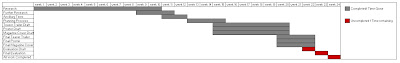

(please click to enlarge)
Tuesday, 15 November 2011
Audience Feedback- Final Versions
To gain further audience feedback for my final versions, I used the same technique of having my audience write on a post it not giving good and bad comments on my teaser trailer, poster and magazine cover. Here are the results I got:
Teaser Trailer Final Version Feedback
Poster Final Version Feedback
Magazine Cover Final Version Feedback
Teaser Trailer Final Version Feedback
Poster Final Version Feedback
Magazine Cover Final Version Feedback
Subscribe to:
Comments (Atom)